
DARLING INGREDIENTS
Reimagining Darling Ingredients’ brand identity and digital platform to strengthen investor confidence and long-term value.
View site
Role
Senior Visual Designer at Huge Inc
Duration
3 Months In 2024
Team
4 designers
Product Managers
Engineering ( Founders
Marketing
Deliverable
Token architecture + multi-brand modes for 400+ components

The problem
Every brand was its own island. Designers were rebuilding the same components over and over
The Solution
Clarity and credibility drove the growth numbers but the real outcome was retention.
The Outcome
400+
Components needing a token foundation built from zero
30+
Consolidated a single site and platform
12.58%
Increase in engagement rate for Darling content.
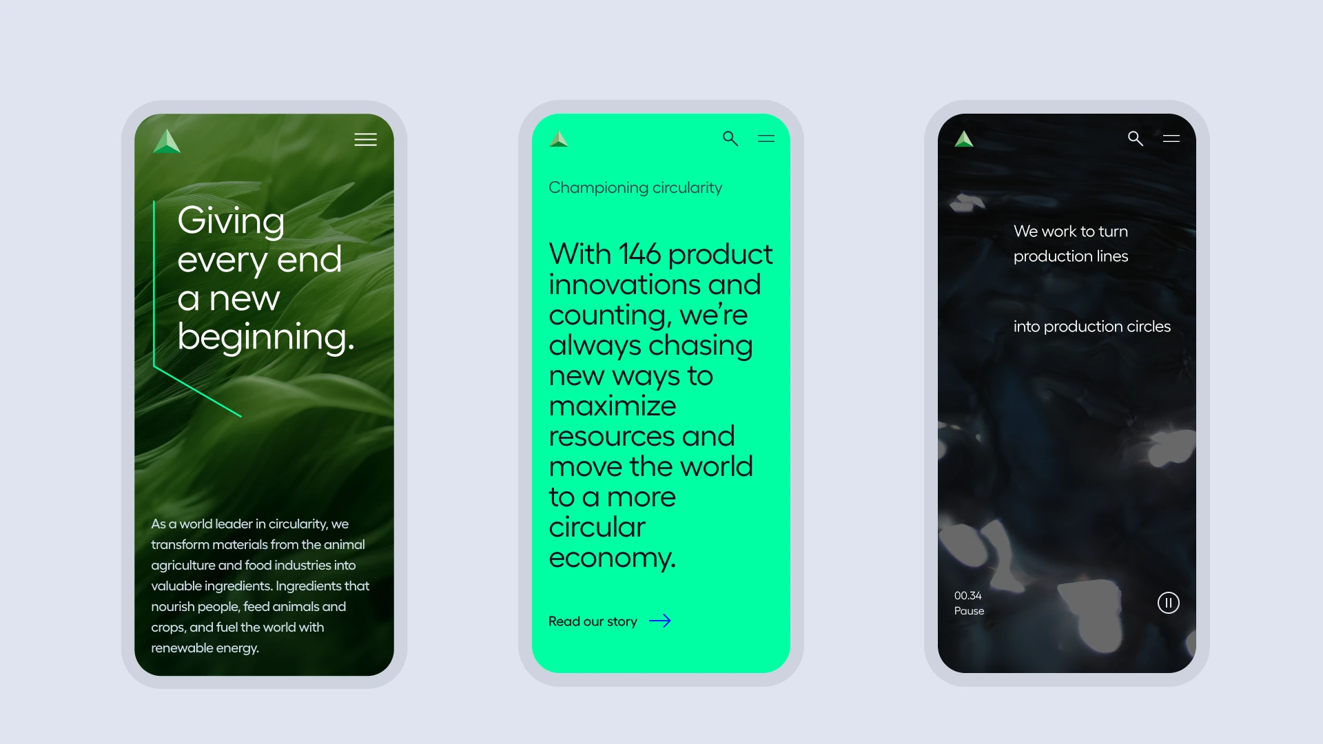
Deep dive on Darling Ingredients
This wasn't a startup with a scrappy design process. This was a Fortune 1000 company with 10,000 employees and a design system problem at genuine enterprise scale.
Darling Ingredients built its portfolio through decades of acquisitions each brand arriving with its own visual identity, naming convention, and digital presence. That's not unusual for a company of this size. What was unusual was that by the time I arrived, there was no shared design infrastructure to hold any of it together.
The problem
Every brand was its own island. And no one owned the bridge between them.
Each of Darling's brands had accumulated its own component decisions independently — built by different teams, in different tools, with different conventions. There were no design tokens, no shared primitives, no documentation anyone could reference. Theming a component for a new brand meant starting from scratch.
Design Cost
Every new brand initiative required designers to manually re-theme components. No inheritance, no variables, no propagation. 30 brands meant 30x the maintenance effort.
Engineering cost
Developers had no source of truth to implement from. Hardcoded values meant a color change in one brand required finding and updating every instance manually across codebases.
Reframing the problem
Every brand was its own island. And no one owned the bridge between them.
Build one design architecture that makes every brand faster to ship without erasing what makes each one distinct.
The instinct on a project like this is to unify everything visually. The smarter move especially at this brand count — is to identify the layer that's truly shared and let brand expression live above it. Tokens are what make that separation structurally possible, not just conceptually desirable.
What I built: Token System
30 Sites. One system. Infinite brand expressions.
I designed the token architecture the layer that everything else would inherit from. I modeled it as a three tier hierarchy: primitive values at the base, semantic roles in the middle, brand-specific overrides at the top. This meant a brand change was a mode swap, not a rebuild.
Working cross functionally I met with other designers, PM's, clients, and legal to ensure there was alignment across both the Huge Inc team and Darling ingredients team to deliver a design system.


What I built: Multi-brand Modes
Created multi-brand modes in Figma that served 30+ websites
I built the multi-brand design token system that served 30+ brands that Darling Ingredients owned. All of these elements, combined, have led to higher engagement with the content of the site.
There was a big impact on design and engineering efficiency designer switching from Sonac to Rousselot to CTH was a single click, not an afternoon.
Before: 30+ manual edits across 30+ files.
Each brand maintained its own Figma library. A button update meant 30+ manual edits across 30+ files. Components diverged constantly with no governance to catch it.
After: One Design System
One component library. One source of truth. Brand expression controlled by variable mode. A global spacing change propagates to every brand in seconds.


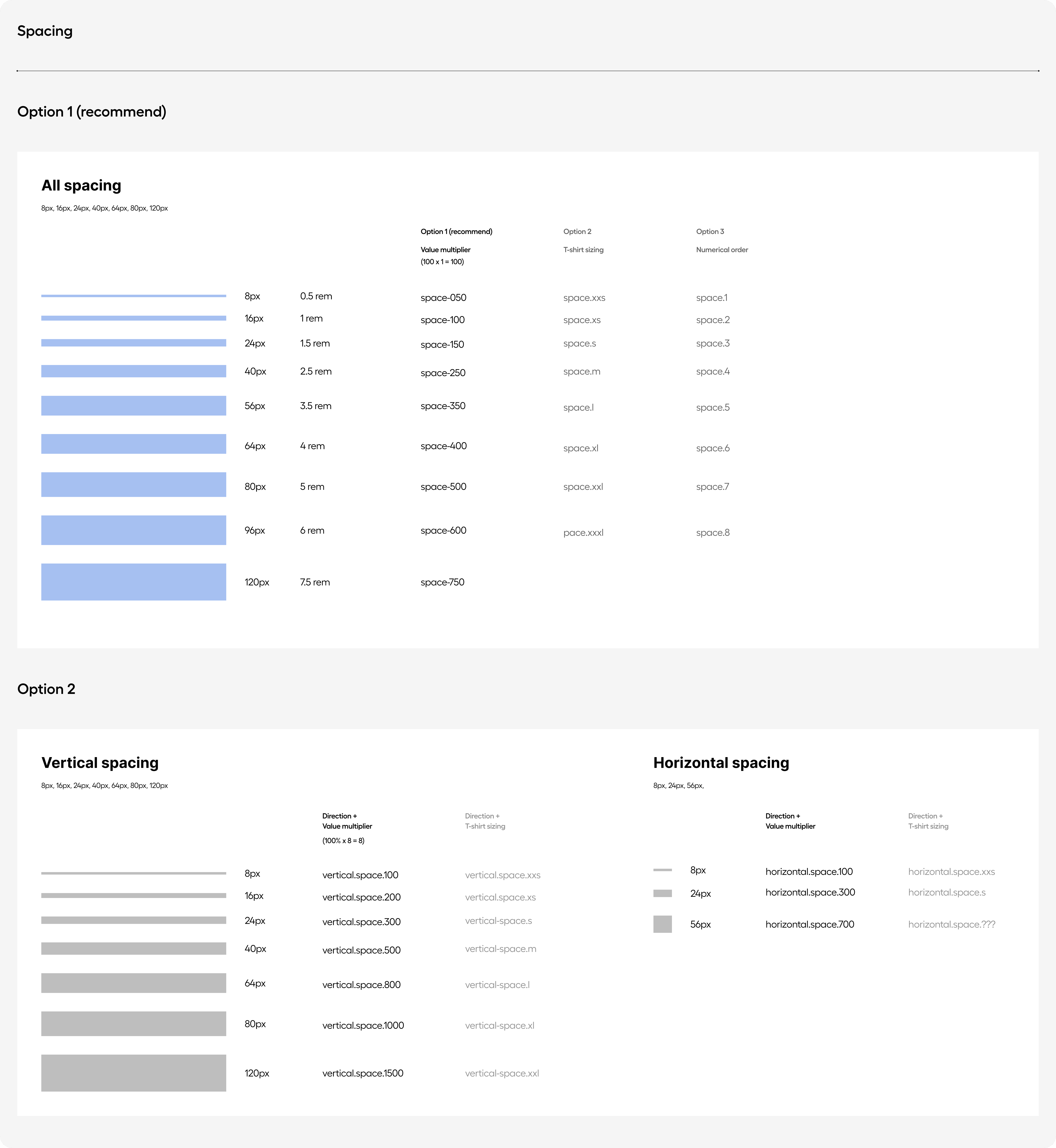
What I built: Multi-brand Modes
A system with no docs is a system only its creator can use. I treated documentation as part of the deliverable not an afterthought.
Every component shipped with usage guidelines, naming rationale, do/don't examples, and engineering notes. The goal wasn't comprehensiveness it was that a new designer or developer could open the file, understand the conventions, and contribute without breaking anything.

Constraints
Three months. Enterprise scale. Starting from nothing.
The hardest constraint wasn't the timeline it was the brand ownership dynamic. Each Darling subsidiary had built its brand independently over years. Getting buy-in for a shared foundation meant making clear that the system served each brand's distinctiveness, not erased it. That required as much stakeholder communication as design work.
90-day deadline
Architecture decisions had to be right from week one no time to rebuild the foundation mid-project
30+ brands
Every token decision had to hold up across wildly different visual identities — from industrial to pharmaceutical
True greenfield
No existing tokens, no naming conventions, no prior Figma variables. Defining conventions from scratch while shipping simultaneously

Outcome
A foundation that didn't exist three months earlier and a team that could now ship across 30 brands without starting from scratch.
The Outcome
400+
Components needing a token foundation built from zero
30+
Consolidated a single site and platform
12.58%
Increase in engagement rate for Darling content.
What this enabled for the business:
A company operating at $6B in revenue across 15 countries needs to move fast and stay consistent simultaneously. The design system makes brand consistency the default not the result of manual effort from a designer who happened to be paying close attention.
B2C
End to end
+400% trading volume
Driving User Trust & Trading Volume on Oku Trade
Redesigned Oku trades core trading experience . While pioneering AI-assisted design workflows that drove 400% increase in trading volume
Open case study

Air Canada
Design System
UI Design
Designing The Next Generation of Booking Flights
While working on the Booking and Shopping agile team, I worked alongside UX to find the blockers to user adoption for 47 Million users
Open case study